


Necessary Always Active
Necessary cookies are required to enable the basic features of this site, such as providing secure log-in or adjusting your consent preferences. These cookies do not store any personally identifiable data.
|
||||||
|
||||||
|
||||||
|

Power BI, a leading Business Intelligence tool from Microsoft, empowers organizations to analyze and visualize data for informed, data-driven decisions. It includes various applications designed to organize unrelated data, making it clearer and more interactive. Numerous Power BI dashboard examples illustrate how teams and departments can effectively analyze their data, enhancing decision-making accuracy.
The global Business Intelligence market is projected to grow from $29.42 billion in 2023 to $54.27 billion by 2030, with a compound annual growth rate (CAGR) of 9.1%, according to Fortune Business Insights. The rising demand for Business Intelligence and analytics is driving the adoption of Microsoft Power BI dashboards. These dashboards not only help segregate unorganized data but also guide businesses toward smarter investments by offering a comprehensive view of their operations. Here are some Power BI dashboard examples that help organizations run efficiently by providing a clear picture of their activities.
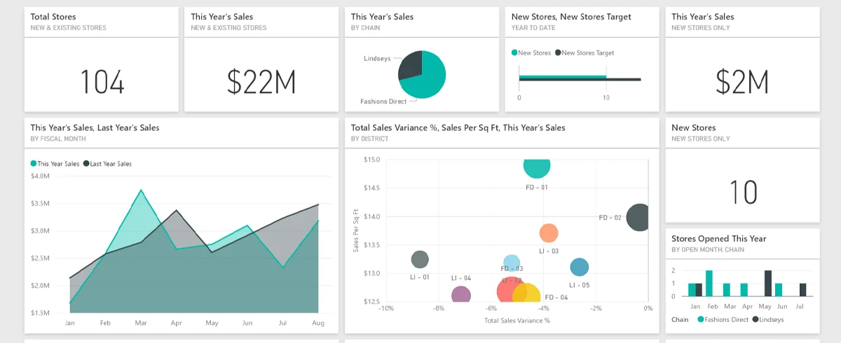
One of the popular Power BI Dashboard Examples is the Retail Dashboard, which helps businesses keep a check on their inventory. It helps businesses analyze top-selling products. In fact, senior managers can check whether all the major products are available in the store.
Purpose of The Dashboard
The Power BI dashboard helps the manager avoid overstocking products and maintain a regular supply of all the products. Additionally, it helps businesses analyze the financials coming from online and offline purchases. Apart from product overviews and financials, it also guides businesses for future investments by showing them data for various categories and customer preferences.
Important Insights
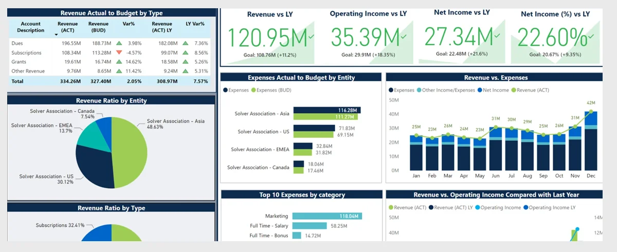
Another popular Power BI Dashboard example is the Finance Dashboard. Using this, organizations can create an executive-level report to showcase their financial insights. It delivers high-level insights that enable users to quickly skim the report for executive-level users. Users also have the choice to go into granular data.
Purpose of The Dashboard
The dashboard gives a broad overview of the company’s financial performance throughout time. Users can also explore financial performance according to area and product category. Users can identify financial patterns and regions of over/underperformance in both of these emphasis areas. These preliminary insights can then be used by users to see where to focus.
Important Insights
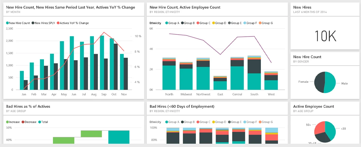
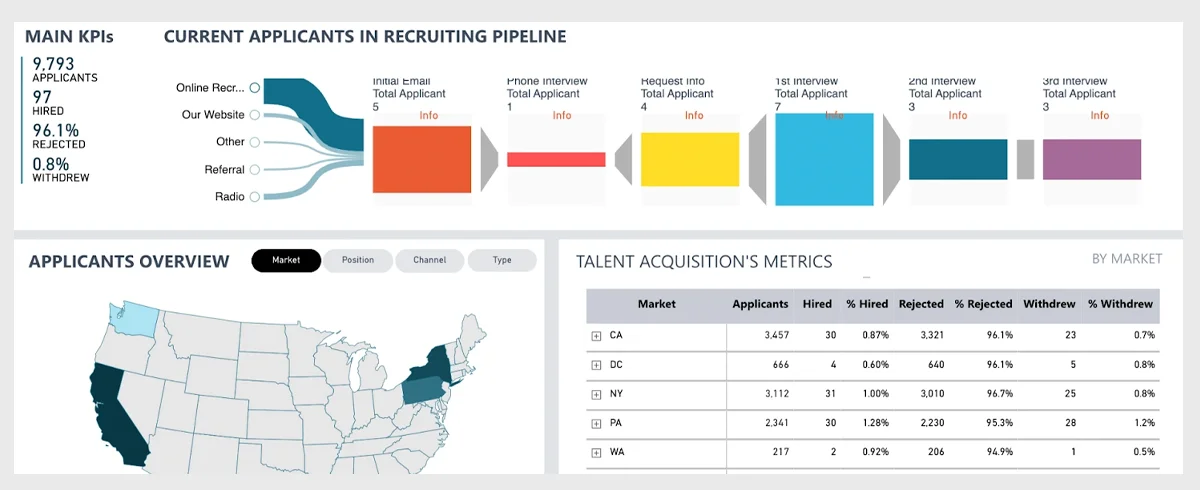
HR Dashboard is another popularly used Power BI Dashboard Example. It is designed for HR managers who want to understand workforce demographics, track new hires, and guarantee they’re adhering to industry diversity guidelines.
Purpose of The Dashboard
The HR team can generate high-level insights, such as average income, average tenure, and average age, to better understand employees These insights enable HR to more effectively include workers in upcoming business decisions. The results help the HR staff in carefully designing a diverse workforce that supports the organization’s objective.
Important Insights
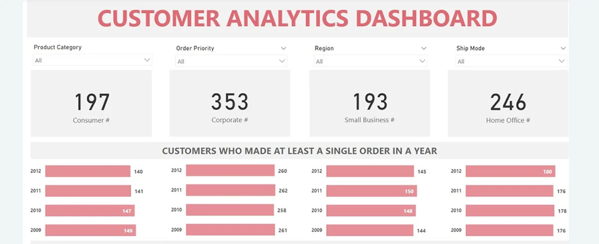
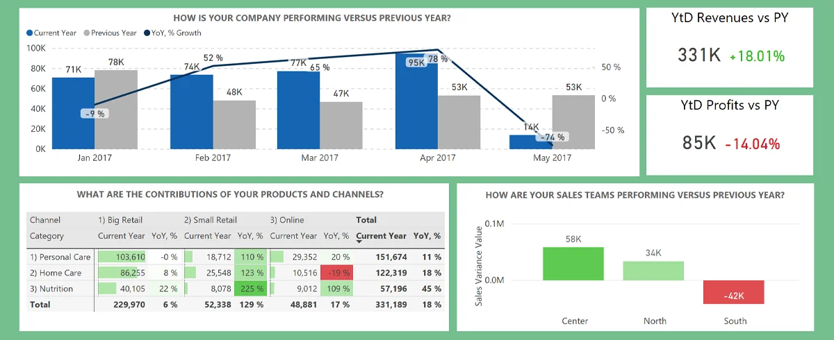
The Customer Analysis Dashboard is most useful for businesses that want to focus more on their customers. It offers valuable insight into profit for regional customers and product sales.
Purpose of The Dashboard
This dashboard can be used in almost every industry where managers and business leaders can use it to analyze business growth. They can even make valuable business decisions to increase revenue, evaluate the profit distribution across customers, and drive profitability.
The dashboard offers information on various factors that can be helpful for businesses handling a lot of data. Some of these factors are the overall profits and sales, past and current year sales, and percentage growth. For example, a company can view data for several years by using various filters. Additionally, this dashboard can provide managers and owners with insightful data.
Important Insights
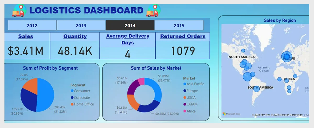
The Logistics Dashboard is helpful for logistics managers to better understand the movement of commodities. They can derive more insights from the dashboard through reports that offer a view by product, delivery mode, and area.
Purpose of The Dashboard
The prime purpose of the dashboard is to assist logistics managers with the flow of products. Moreover, it can assist them in allocating resources to satisfy delivery criteria and maintain an efficient operation by identifying locations of high or low product flow. Overall, by more effectively using its resources, the organization becomes more efficient, essentially saving time and money.
Important Insights
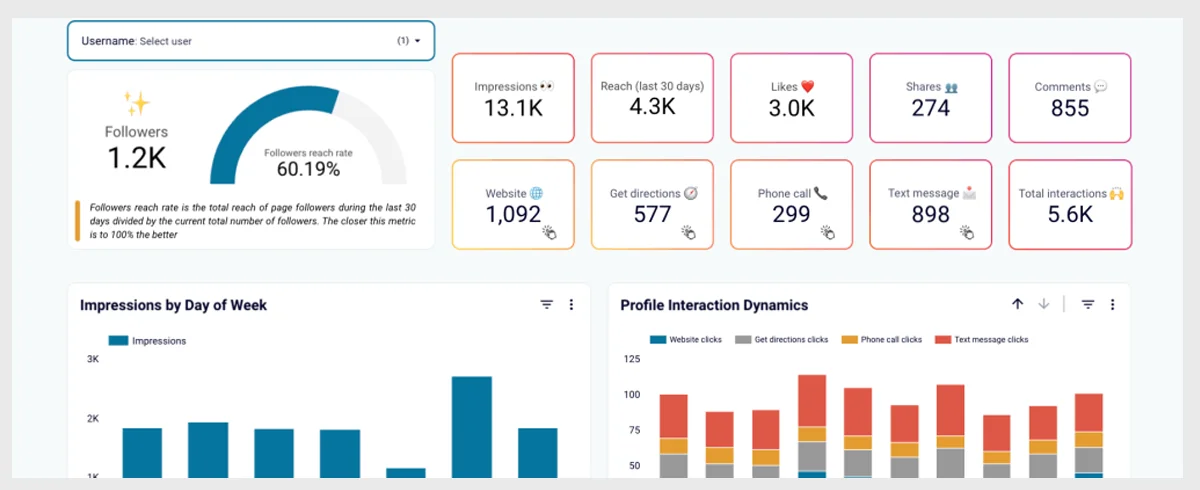
Social Media Monitoring and Analytics Dashboard is great for managers, marketers, and agencies. This monitoring and analytics tool can help your product quality, improve sales, and crisis control.
Purpose of The Dashboard
The tool can also help businesses and organizations understand their audience’s opinions about the product. This dashboard shows data focused on different aspects of social media on a monthly basis, including web sources, discussion intensity, online influencers, special categories, sentiment analysis, quotes and geolocation, and many more.
Its discussion intensity tab offers critical insight such as mentions on social media, total reach, and much more. You can also find a chart that shows influencers by impact, volume, and amplification.
Important Insights
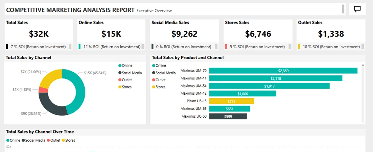
The Marketing Dashboard is another popularly used Power BI Dashboard Example. Power BI allows organizations to correlate marketing analytics from various sources, thus eliminating the possibility of false positives in the team. By establishing connections with services like MailChimp, Google Analytics, and others, Power BI enables to quickly generate dashboards.
Purpose of The Dashboard
The Dashboard helps marketing teams identify trends and patterns within a set of market research carried out with customers. It can provide a visual representation of their research, allowing them to spot correlations between various customer data points. These insights can help the team understand their customers and therefore learn how to better accommodate them.
Important Insights
Businesses need to constantly track their sales for different purposes. But, with too much data, it might get a little hectic to keep track of everything.
The sales Scorecard dashboard is a simple answer to several different questions. It helps business organizations track their sales and answer all the critical questions about sales performance.
Purpose of The Dashboard
This dashboard leverages several Power BI elements to build KPIs that can provide crucial and valuable insights to help sales managers. These Power BI elements include treemaps, cards, shapes, and DAX.
Important Insights
Executive Insights Dashboard sheds light on business performance and its overall health. This dashboard is helpful for business organizations as it gives them the ability to explore company-wide data-driven decision-making.
Purpose of The Dashboard
Executive Insights dashboard allows businesses an opportunity to view their business data from more than one angle based on its attributes including products, country, year, order type, and many more.
Important Insights
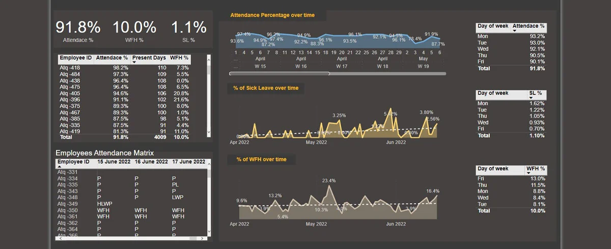
The last to be on our list of popular Power BI Dashboard Examples is the Attendance Tracker Dashboard. The dashboard helps business administrators track the attendance of employees across the different departments.
Purpose of The Dashboard
This Power BI Dashboard Example can increase engagement between key stakeholders and drive critical conversations. Stakeholders of any business organization can increase their attendance and improve performance with the reports from this dashboard in different sectors.
Important Insights
Related Post – 5 Ways to Speed Up Your Power BI Dashboard
We hope this blog has provided a comprehensive overview of the various Power BI dashboard examples that businesses and organizations can utilize. These examples can be customized for diverse applications across multiple industries, ensuring flexibility and relevance.
Microsoft Power BI serves as a powerful data visualization tool that enables companies to monitor key areas such as marketing, sales, human resources, KPIs, and inventory. Teams can collaborate using the same data and reports while sharing insights across different applications, all while ensuring data accuracy, consistency, and security.
However, businesses should be cautious when adopting overly complex tools too quickly, as the steep learning curve may require additional resources for effective implementation. Ultimately, Power BI dashboards empower organizations to create visualizations that simplify intricate data and reveal hidden insights, allowing leaders to make informed, data-driven decisions that can drive the business forward.

Sign up to receive our newsletter featuring the latest tech trends, in-depth articles, and exclusive insights. Stay ahead of the curve!
