


Necessary Always Active
Necessary cookies are required to enable the basic features of this site, such as providing secure log-in or adjusting your consent preferences. These cookies do not store any personally identifiable data.
|
||||||
|
||||||
|
||||||
|

Data Visualization has emerged as one of the most critical tools for both simple and complex corporate structures and plays a key role in success in business today.
It is a field of Data Science that handles the visual representation of the most complicated datasets. Visualizing data is a major challenge due to the colossal volume of information available – and the need to present it in a meaningful way.
It is surprising to discover that around 2.5 Quintilian bytes of data are generated across the globe on a daily basis. In simpler terms, 600 Wikipedia pages are created every minute.
Unimaginable, isn’t it? It is difficult for businesses to manage, interpret and visualize such huge volumes of data, yet extract information that is relevant and crucial.
How could your business ever manage such a massive volume of data?
The answer lies in the field of data science. Data science is about more than analyzing data; it is about finding the meaning of the information. Conventional analytics can only get you so far. Data Visualization solves this problem by presenting the data in easy-to-understand, customizable graphs.
Today, there are a variety of tools available from Tableau, Google Data Studio, and Power BI. There is an ever-growing list of free Data Visualization tools, designed to help the professional data scientist in the visualizing of information and the discovery of messages in the data.
Read the Full Article to get the Answers Of:
If you want a simple business intelligence tool for your desktop, Tableau tops the chart. It’s by far the simplest and the best Data Visualization tool that you can use, no coding required.
Tableau is one of the fastest evolving Business Intelligence (BI) and Data Visualization tools. Tableau turns Data Visualization into an interactive and shareable dashboard that is simple to use. With the help of Tableau Public, you can picture the latest trends, changes, and data density with the help of graphs and charts.
Tableau was founded in January 2003 by Chris Christian. The idea was first mentioned in an academic paper way back in 2002 – to design a special tool that allows users to visualize data in a simple way. Many doubted the need for the new Data Visualization tool when Excel already allowed us to create bars, tables, and pie charts. Why did Tableau succeed?

Tableau has emerged as one of the most effective and fastest advancing Business Intelligence and Data Visualization tools.
Gartner considers Tableau to be the gold standard for intuitive interactive visual analysis, and an established Enterprise platform. You can represent your data in any way that you want, from static visuals to interactive resource delivery.
You can tweak the graphics, you can play around with them, and you can select from different charts. The tool also has exceptionally good production dynamics. It only takes only a few seconds for you to graph the visualizations. Tableau remains the top interactive tool.
Tableau Public is probably the best Data Visualization tool available because it allows users to create awesome visualizations without having to know how to code. The key feature of Tableau Public is that it allows users to easily connect to several databases.
The tool has the power to transform your data into interactive dashboards, with the ease of dragging and dropping the fields. Additionally, Tableau Public enables users to share visual images online so that other users can download that information easily.
Tableau Public is the same version of Tableau, but without the subscription, Tableau Public does not provide the privacy you receive with the paid version. Everything you create with this tool is available for public review and is automatically available on the web.
Compared to Microsoft Excel, Tableau is a fast, easy-to-use tool for making visual charts and telling interactive stories on the web. The tool is great at building visualizations and is an ideal assistant for any kind of business that collects data to help making business decisions.
Tableau has managed to stay in Gartner’s magic quadrant for years now and is respected as the top interactive BI tool.
Also Read: Top 11 Best Big Data Tools And Software That You Can Use In 2020
These features keep Tableau ahead of other software.
More than 300,000 data enthusiasts are reported to use Tableau as a free data storytelling platform for data journalism, public advocacy, and other needs.
Game of Thrones in Words created with Tableau
https://public.tableau.com/en-us/s/download
Power BI is similar to Excel’s desktop BI Data Visualization tool but is far more capable than Excel. It supports the utilization of multiple data sources, the price is reasonable, and it can be used as a separate BI tool. However, there is no way to integrate it into existing systems.
Power BI has several similarities to Excel’s desktop BI tool, but the features and functions of the former are far more effective than the latter.
Power BI enables multiple data sources, yet it remains reasonably priced. The limitation with Power BI l is that it can only be deployed as a separate tool with no scope for integration with existing tools.
Microsoft Power BI is a suite of business analytic tools that help you create and share intuitive reports for business insights. The tool allows you to create and modify Data visualization, join data from multiple sources, and build dashboards.
Microsoft Power BI also allows users to successfully import essential data, generating a report with visualization. This Data Visualization tool also allows you to share your data by publishing it to the Power BI service with one click.
With Microsoft Power BI you can extract any kind of information. For example, if you have a lot of reports that you have published, you can find them easily using the search tool. The Power BI interface further allows you to manipulate the reports that you are sharing.
You can import additional data by pushing the data button. Keep in mind that you can import data from a variety of sources. You also must remember that all your data does not need to be from the same source; Excel spreadsheets, SQL Server data Query, or another data query source are all feasible. You can put them all together in Power BI by creating the relationship, manipulating that data, and then by creating impressive visualizations.
Whenever you are importing queries, make sure that you have all the data that you need. Power BI is smart enough to detect the relationship between the data and join different datasets together. If the Power BI Data Visualization tool fails to recognize a relationship between the data, you can establish that relationship yourself.
Power BI further allows you to sort the data and change the format prior to creating visualizations. You have the option of combining the data into a single canvas page, or you can use multiple pages for unique perspectives on the information.
The tool also allows you to,
Microsoft Power BI allows you to import data, manipulate it quickly, and then securely share the insight. To get started with the free BI desktop application, download the free application. You can then connect with hundreds to data sources like Excel, Salesforce, Google Analytics, Social Analytics, and even ILT devices. All this data can be converted into live, interactive visuals.
When you have mastered the Free Power BI tool, you can upgrade to the Pro version. With the paid version, you can start collaborating freely. You can connect to different dashboards and deliver a 365-degree view of your business.
You can also control how your data is being distributed, packaged, and used with your colleagues. With the Premium version, you can export your content for use in your digital properties across an enterprise.
Also Read: How To Pick Out Best CRM Software
Power BI is a strong BI Data Visualization tool and is useful in many ways.
It has been estimated that Power BI has more than 5 million subscribers – this is the milestone achieved by the Power BI company and it speaks volumes about how highly regarded this is. It has been estimated that data use would reach around 50 zettabytes or more by 2020.
Have You Ever Struggled to Build Dashboards Fast?
Remember those sleepless nights when you have been trying to create a visual image, but in vain? I have been in your position, so I understand the pressure of time, output requirements and being able to get a concept across in an easy to understand form.
To cut a long story short, I found Google Data Studio, which is a great solution to represent your data and create powerful reports. This Data visualization tool helps you connect your data and insert it seamlessly into reports. Google Data Studio allows you to create clean and powerful reports and share them amongst your group.
Google Data Studio is a free Data Visualization tool that helps to illustrate your data. At this time, the Dashboard market is fragmented and there are plenty of different solutions. Usually you must choose between heavy BI tools which allow you to do everything, but the licenses can easily cost you US$50k and more.
Simpler solutions can be quite limited and may not cover all your needs. Thankfully, there are easy to use solutions available for your business. Google Data Studio is an example of a great free solution.
This platform allows you to create and share beautiful reports – quickly and effectively. If you run a small or medium sized business, or even a department in a big corporation; this Data Visualization tool is the perfect choice.
Google Data Studio is an interesting tool as it constantly evolves, meaning that there are always new features being integrated. Recently, new formulas have been added to the mix that give you more options. In Data Studio, you can add to your data set with calculated fields and then utilize formula events.
Google Data Studio gives its consumers the option to have multiple views of their data. The tool enables its users to visualize data like charts, graphs, and pies.

The tool can further be integrated into Google Analytics, creating a unique combination of the two. Both Google Data Studio and Google Analytics have free-to-play versions to get you started.
Good Data Studio is part of the Google Marketing Platform and it has an impressive ecosystem of tools.
To get started you have to visit http://datastudio.google.com and sign-in using your Google account.
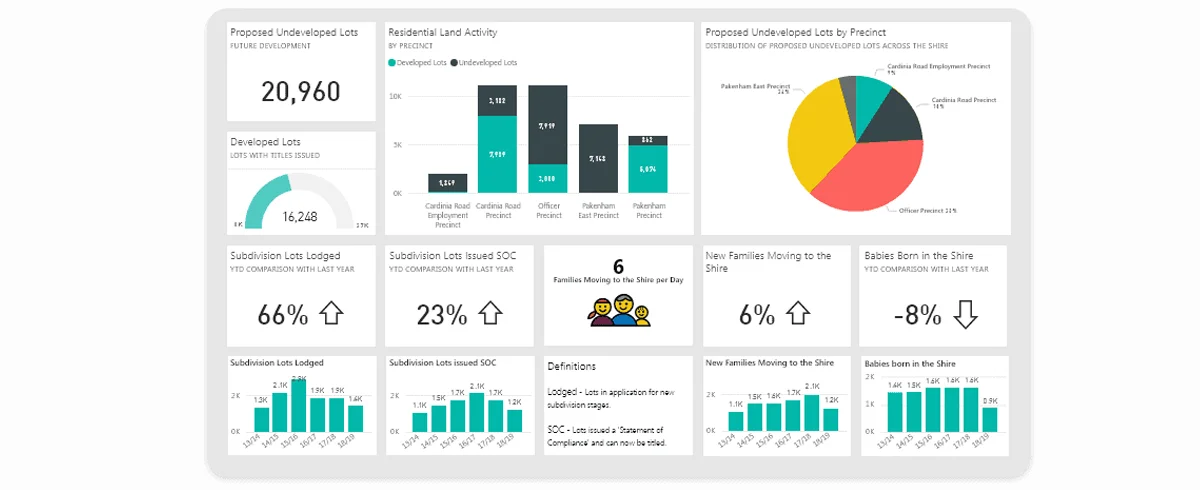
If this is your first visit, you need to set up Data Studio. Press ‘Get Started’ and agree to the terms and conditions. The tool is available for personal and company use. You can also purchase a subscription. The screenshot below shows the data studio dashboard:
Data Studio gives you a rich selection of styles to make your reports attractive, compelling, and on-brand for your business. The ‘arrange’ menu lets you align components, group them and control how they overlap. To view this report as your colleagues see it, you can click the ‘Edit’ toggle.
This simple report may not look like much yet, but it is live data. You can interact with your data by manipulating the data points. You can also change the date range of the data for clarity and closer focus. There is a lot more you can do with Data Studio besides just visualizing information.
There are few major concepts in Data Studio. They are the Data Source, Connection Report and Explorer.
Data Sources and Reports have many relationships. This means that one report can integrate multiple sources of data. The same data source can be connected to many reports.
Once you introduce a change into one report, the changes will automatically appear in all the connected reports, but It is not that evident from the UX perspective. You can connect information from various platforms like BigQuery, YouTube, Google Analytics, Facebook ads, Spreadsheets, and others.
There are connectors provided by Google, and created by the community, for merging platforms. If you need to create a custom connector, you can either create it yourself or transfer data from storage.
With Data Studio you can easily navigate between Reports, Data Sources and Explorers using the top menu. Google provides a few samples of free dashboards, or you can create your own.
Since late 2018 Google Data Studio has added new features giving users a chance to create charts, graphs, and other forms of visualization. You can share these images with other users.
Also, Google Data Studio allows to,
Data Studio is part of the Google Marketing Platform. Recent integration with Google Cloud allowed Data Studio to easily access data from Google Analytics, Google Ads, Display & Video 360, Search Ads 360, YouTube Analytics, Google Sheets, Google BigQuery, and a whole list of other data resources making Data Studio a highly popular Data Visualization tool used by millions of happy customers worldwide.
Nowadays, thousands of companies worldwide, including leading brands, choose Data Studio as their marketing reporting tool.
Favorite Community-Built Visualizations in Google Data Studio
Have you ever encountered a situation when you have interesting information, but you need to present it in a more interesting manner than raw spreadsheet data? If yes, Openheatmap is a viable solution. With Openheatmap you can map your data across any geographical area, presenting it in context and giving it a better shape and form of presentation.
The traditional data sources, such as Google Spreadsheets, are used for an interactive, animated view of a geographical area, that can be shared online. Developers traditionally use a JQuery plugin. This simplifies the process of creating a completely open-source mapping component on any web page. These are created based on either Flash or HTML5’s Canvas element.
Openheatmap is another free visualization tool that allows you to share heatmaps and tell stories with that data. The tool makes it easy to transfer data from Excel files and Google Docs and to produce a heatmap.
All you have to do is to open the Excel file and make sure that your Excel file data has correct names for the columns. Then you go to the website, choose the Excel file, and upload your data. That information is enough for the Openheatmap tool to automatically recognize the information and create a visual map.
With Openheatmap you share your story with other individuals and create the best possible “visual aid” for your audience. This Data Visualization tool allows you to fix your image to the geographical area you want it to examine. It makes it much easier for reader to grasp the trends and tendencies your data represents.
The Openheatmap tool allows you to share the link and send it to other people. This Data Visualization tool works best with Google Spreadsheets and Microsoft Excel.
You can use your own dataset to create your own Heatmap by following a simple procedure of uploading your own Excel or Google Docs files.
The procedure might seem simplistic, but the results can look great. I recommend that you try out Openheatmap.
Created by Pete Warden, OpenHeatMap is a free Data Visualization tool used by tens of thousands of non-technical users every year.
Image Source: Journal Article by Breinholt, J., Porter, M., and Crandall, K., titled “Testing Phylogenetic Hypotheses of the Subgenera of the Freshwater Crayfish Genus Cambarus (Decapoda: Cambaridae)”. 2012/09/26
Image Source: Journal Article by Breinholt, J., Porter, M., and Crandall, K., titled “Testing Phylogenetic Hypotheses of the Subgenera of the Freshwater Crayfish Genus Cambarus (Decapoda: Cambaridae)”. 2012/09/26
Leaflet is a modern, open-source JavaScript library for mobile-friendly interactive maps. It is designed with simplicity, performance, and usability in mind and works efficiently across all major desktop and mobile platforms. Leaflet can be used with many plugins, coming with an easy to use and well-documented API.
Leaflet works efficiently across all the major platforms, straight out of the box. It presents the visualization as an HTML file that can be interpreted by a wide range of browsers. The tool is not suitable for beginners, you must have basic knowledge of JavaScript and HTML.
Leaflet is a JavaScript library where you insert your Data Visualization algorithms. If you are familiar with the command line, or with the application programming interface (API), then this tool is for you.
Leaflet can be extended with a huge number of plugins, this is not common across other Data Visualization tools – however, it requires a basic knowledge of HTML, CSS, and JavaScript.
The visualization starts by setting up directories. You can then download the project into the map folder. You will need folders for the libraries and others for data. You can download your data in ‘shape’ file format, but you will need to convert this data to QGIS.
QGIS is a format for encoding a variety of geographic data structures. To do this, you need to download and install QGIS.
QGIS is an open source software that you will use to prepare and view your data.
The first thing that you need to do is to download the ‘Geany’ text editor. You can use other text editors like ‘Online Notepad‘, and ‘Net Beings’.
You must follow certain steps to download your data into a Leaflet library, then download the Leaflet library. You can use the hosted version of the library or you can download the local copy. Downloading the library will give you the opportunity to use the library offline.
Google Maps used to be free, however recently Google has updated its terms of service. Today you need registered credit cards to use the Google Maps API key.
Returning to Leaflet, it allows us to generate data-driven maps using an open-source JavaScript library for mobile-friendly interactive maps.
With this tool you must choose the layer of information that you want to display to users. You can switch between layers when you have two parameters.
You can also add different layers to your map. You can further create your own marker and draw demarcation lines, indicators, etc. You have the option of grouping your elements to display them all at one time.
To use this program, you must create different layers of information by adding these layers to your map. The tool uses JavaScript and requires some tech knowledge from the user.
Leaflet & Key Features
Leaflet is an open source JS library for mobile-friendly interactive maps, created by Ukrainian Web Developer Vladimir Agafonkin.
This free Data Visualization tool allows a user to build rich, interactive, and mobile-friendly visualizations of high-volume data with 100,000+ points, just using the power of a browser.
The tool is used by thousands, including media sources such as NPR, Washington Post, and the Boston Globe.
DataWrapper is a Berlin-based company built by a multinational group of designers, developers, and journalists. The tool is primarily designed for creative writers, bloggers, and journalists. It helps people produce great visuals to accompany their articles.
This Data Visualization tool is also useful for other professionals looking for similar data insights and it provides both free and paid versions.
DataWrapper is the preferred tool of the journalist. Media professionals are extensively using DataWrapper in their newsrooms. However, its use is not limited. Instead, the tool can be pretty much useful for anybody who wants visualizations to be incorporated into their articles.
This Data Visualization tool helps to create charts and maps. All DataWrapper graphics are responsive and look good both on desktop and on mobile devices without additional work from your side. They also look good on the page where they are going to be printed.
There are different templates or different themes in DataWrapper, helping the designer create effective presentations. The tool has a menu where you can create the different types of charts, graphs, and tables within the program.
All graphics and charts from DataWrapper have a nice user interface, where you can highlight different elements and interactivity, or add specific points to the graphics. You can create doughnut charts and pie charts, amongst others.
The tool allows you to create cartograms, you can also create symbol maps, and simple locator maps. To create locator maps, you have just to create a location and insert them inside your map. You can also create a shaded relief map to develop different and interesting images.
Next are tables. You can use tables to create graphics to explore raw data. You can also use tables to combine several types of graphics together.
DataWrapper has many map features and has a selection of maps included (about a thousand preloaded maps have already been inserted).
The tool provides you with online learning classes, so that is awesome if you are a newbie to building Data Visualizations. DataWrapper also has a special “free zone” stuffed with images that have been created by DataWrapper’s users.
With DataWrapper it is easy to create charts and maps. For example, you can easily design a choropleth, symbol, or a locator map. You are also free to create a chart of your choice, depending upon your data.
Finally, all DataWrapper images are optimized for mobiles, which is important in a modern web data development environment.
The best thing about DataWrapper is that all its charts are:
Created with the intent to support data-driven journalism, DataWrapper is designed for journalists in newsrooms. The tool has been designed to help users create high-quality charts by following a simple procedure. It has been estimated that the total number of DataWrapper users has reached about 50.000 registered users. The majority are writers and experienced journalists, or people involved in the communication process fields.
Data Visualization is becoming more and more critical as volumes of data are accumulating. There are several effective tools, discussed here, and there are many more that are in the making. The bottom line is that an individual or an organization must first understand their requirements and budget before analyzing the data.
Google Data Studio provides an excellent introduction to data analytics, but you can begin with Leaflet if you have coding expertise. With Tableau (paid version) and Microsoft BI, you can also build rich, fully-featured presentations for your colleagues. You need to find the application that best works for you.
Coding gives you a chance to design and customize the graphs, thus arranging your scattered data into a beautifully arranged set of information. The list of free Data Visualization tools discussed in this blog post is not complete, as there are many other awesome tools worth mentioning and considering. I am always searching for more tools to try and discuss that can simplify the visualization process for others.

Sign up to receive our newsletter featuring the latest tech trends, in-depth articles, and exclusive insights. Stay ahead of the curve!
