In this article
5 Power Tips for Microsoft Power BI
In this article
Introduction
Business Intelligence (BI) tools are the talk of the town!
With the increasing importance of data in the business world, business intelligence tools have taken center stage. More so because, they can make the complex task of retrieving, analyzing, transforming, and reporting data simple and less mundane.
Today, most companies use BI tools to empower their teams with the right data. Though there are plenty of tools available in the market, Microsoft’s Power BI is the best interactive data visualization and analytics tool for business intelligence (BI).
The best part about Power BI is that it offers many advanced functions for data analytics and you don’t have to be an expert to leverage it.
We are not going to tell you how to do all the things you possibly could with Power BI. But we have touched upon this subject in our previous blog, you can read more about it here.
In fact, it is very useful, regardless of the knowledge of data analysis. In this blog, we bring to you the top 7 tips on how to make the most of Power BI reports. Let’s get on with it:
Tip 1. Keep It Simple
Power BI offers an increasing number of visualizations that are available in the Power BI gallery. With this larger gallery of visualizations, you might feel overwhelmed to use all of them at once.
But there have been many instances where people try to use multiple features and they often fail. This is mostly because when you put too many things on a Power BI dashboard your users will not necessarily find all the little features and click on all the slicers.
In fact, for many of them, understanding the dashboard can be quite overwhelming. Hence, when you are designing a Power BI dashboard for ‘ordinary people,’ make sure it’s simple, easier, and clearer. So, focus on simplicity!
And, remember, don’t fear the old-school tables as they are still the best way to present raw data. Also, try to avoid pie charts and treemaps for this data as users cannot see the difference between pie fields.
Let me give you a better idea, below is the report for the sales volume per region. Take a look at it and try to tell which area among red and orange is bigger.
The report shows sales volume per region in the form of a pie chart which makes it hard to differentiate between sales in Europe (red) and sales in North America (orange)
On the other hand, look at this report below:
The report showing sales volume per region in bar graph format which provides simplicity when differentiating between sales in Europe (red) and sales in North America (orange).
Tip 2. Context
One of the coolest features that you’ll find on Power BI is the cross-filtering capability. The software allows you to first connect two different charts with data and put them next to each other.
Now, when you’ll click on an element of one chart, the other one will be automatically filtered based on what you clicked.
This feature is immensely helpful for data comparison, kind-of-visual drill-downs, and simple analysis. In fact, you can actually use three ways of filtering and connecting data. This will make your analysis experience much better and easier.
Let’s consider the example of project management: You can see time reported by people (top bar in the below example) and the time reported each month (the bottom bar). Here, you can see the different behaviors the interactions provide.
Besides, a lot of data elements might greatly influence the ease of use of the report, especially for not advanced users.
Tip 3: Divide and Conquer
Filters are the most basic concept of data visualization and yet you will be surprised by finding how many filtering possibilities there are in Power BI. Here, are some of the most obvious ones.
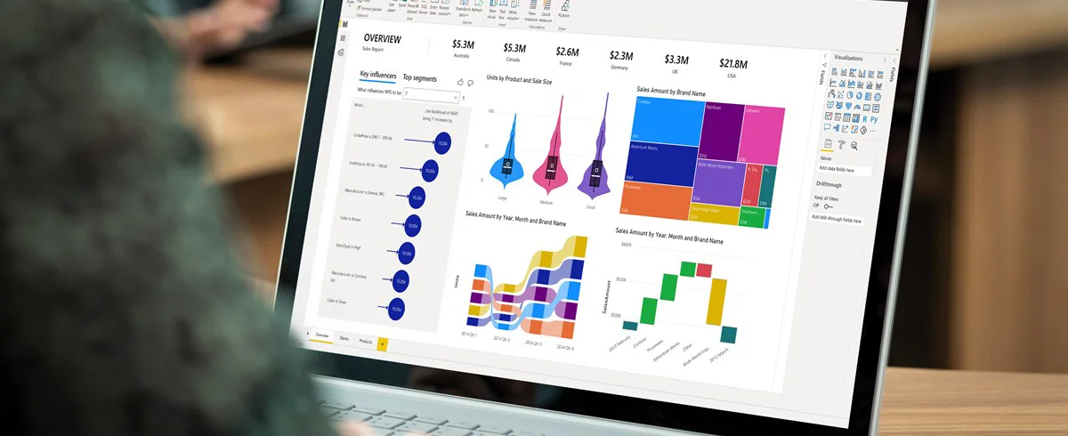
Basic Report Filters Panel:
Visual Level Filter filters data only at the selected visual level to have some background data only for filtering.
Page-level filters are applied to all elements on the page
Report-level filters are applied to all pages to see the data in the same filter.
You select a filter and then immediately move to the next page. The filter will stay selected which will help you to see data in the same context:
Report filters panel – for those who are supposed to go through pages to see data in the same filtering context.
Two In-canvas Filters:
Slicers (in-canvas filters) – are available as single or multiple selection dropdowns.
Cross-filtering – can be used instead of slicers to include additional information. For example, you can create a checkbox list from a vertical chart and use it just for filtering by just clicking on the bar to filter out everything else:
Again, let’s consider the previous example: you have a multiple-page report with pages that gives you an overview of hours or details of time reported under particular tasks.
So, when using in-canvas filters, you need to select the project on each page individually. However, when using a report level filter, it is still selected when you browse through different pages.
Tip 4. Create Hierarchies
If you want to show data analytics on various levels of granularity using the same visualizations, hierarchies are your best bet. For instance, a program manager might be interested in project progress and time reported per month, while a project manager could be interested in a weekly level, in a project management domain.
In such a case, creating a separate report is not an option as you will then end up managing a large number of cases. The solution to this problem is to design a report in such a way that it can be used by both. Here, the hierarchies can come in really handy.
You can use hierarchies in three ways:
- It can be based on the data source, basically present in the data model
- It can be based on date and time data, basically, present any time data as a Year/Quarter/Month/Day hierarchy.
- It can be based on more than one dimension. It will not make them visible but allow them to drill from one another.
Once done, the small arrows in the corner of the chart can go up and down the hierarchy levels. With the help of this, you will be able to achieve different perspectives from the same visualization and report.
Tip 5. Focus on Quality, Not Quantity
Power BI offers so many features that some people could easily end up making a Picasso-like analytical painting. Just remember, you can add as many effects and colors as you want but that doesn’t mean it will hold much value.
With Power BI, you will be able to produce any number of beautiful charts in a matter of seconds with any number of data pieces.
Yet, it is more important than the time you spend on the tool should be spent on trying to visualize crucial information in that space. Your ultimate goal should be to present clear and easy-to-digest information to potential users at first sight.
Conclusion
The tips and tricks we have shared in this blog are the very basic concepts that can help you create powerful reports. They should be simple and easily understood by regular users to create an impact.
These tips can be easily incorporated by people across project management, finance, and development practices. They all focus on the users’ needs due to their simplicity and spend more effort on the most efficient way to tackle the particular piece of data.
Tech Insights Digest
Sign up to receive our newsletter featuring the latest tech trends, in-depth articles, and exclusive insights. Stay ahead of the curve!


