
How to Create a Dashboard in Power BI for Beginner

Introduction
Imagine a Sunday morning, you wake up and with nothing in your “to-do list,’ you start scrolling through Instagram. After a few minutes, your stomach growls and you realize it’s been 3 hours.
Well! Don’t worry, we all do!
Fun fact, the human brain is usually attracted to data which is in the form of images, video, and other visuals.
Here are some facts which can help you understand why our brains value visuals over any other type of information.
- 90% of the information transmitted to the brain is visual
- The human brain processes an image in just 13 milliseconds
- 50% of the brain is active in visual processing
- Human brains process visuals 60,000 times faster than text
 So, it’s an absolute no-brainer why you can spend hundreds of hours on the internet without getting tired.
Today, we are exposed to 5x more information than in 1986. Companies are battling for attention with the rising amount of data and shortening human attention through data visualization.
Data visualization can make complex data simple. It can take mundane raw data and transform it into actionable business insights. Hence, data visualization is easier to understand and it can provide a compelling argument.
But, how does this translate into the business landscape?
- American Management Association says that the study found that the use of data visualizations could shorten business meeting by 24%.
- Tableau says managers with visual data recovery tools are 28% times more likely to find timely information than those relying on reporting and 48% of these managers can find the data.
- Bain & Company says companies with advanced analytics are 2x more likely to be in the top quartile of financial performance and use data for making decisions, 3x more likely to execute intended decisions, and 5x more likely to make decisions faster.
- Nucleus Research says that a BI with data visualization capabilities will offer an ROI of $13.01 back on every dollar.
I hope these stats have made your learning journey more interesting and fun. So, let’s start by understanding a bit about Power BI Dashboards before we dive deeper into its realm.
What is a Power BI dashboard?
Power BI dashboard is a page that tells you a story with the help of visualizations. You can also check out some amazing Power BI Dashboard examples.
What is a Dashboard in the Power BI dashboard?
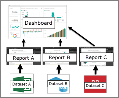
The dashboard is a distinguishing feature of Power BI as it monitors your data. It is responsible for providing a consolidating view by combining the on-premises and cloud-born data.
In this blog, we have created a step-by-step guide to help you create a Power BI Dashboard for your business.
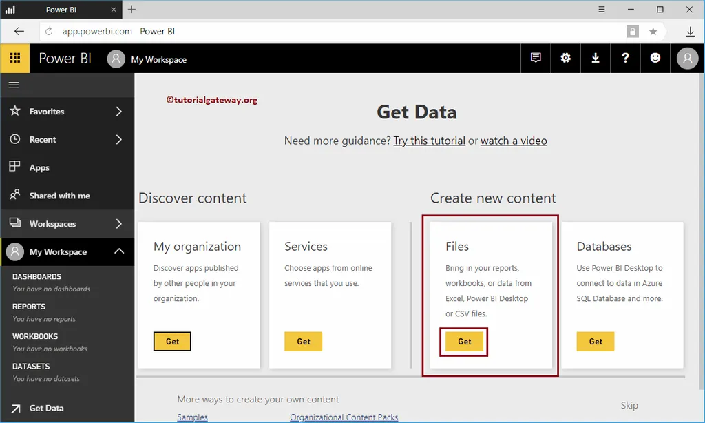
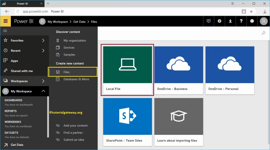
1. Import your Collected Data
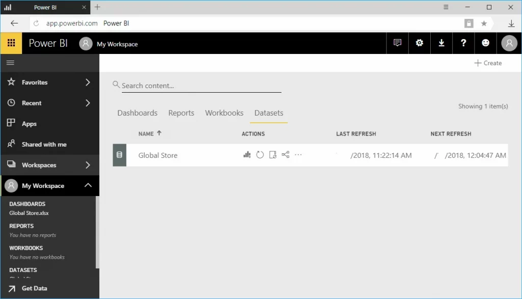
Launch your Power BI application and give it access to your important data. By clicking on add, you will be able to import all your dataset from an MS Excel Workbook.
Please note that the dashboard will remain empty until you give it data.
 Source: Tutorial Getaway
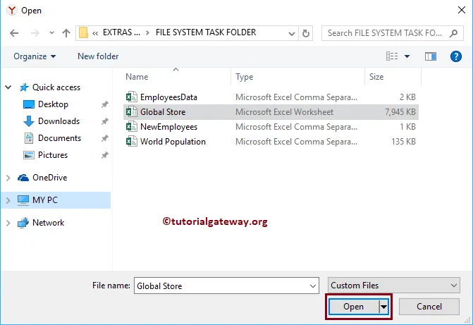
The application will give you an option to navigate through files and you can browse to the location.
Locate the file and add them to the dashboard. Some files might take a little more time to process depending on the size.
 Source: Tutorial Getaway
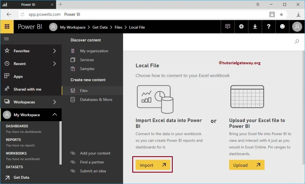
After the file is imported, you will see a workspace, there you can choose the imported dataset. Which will change the blank workspace into a visualization creation tool.
2. Work with Your dashboard
Once you have added data to your dashboard, it’s time to add tiles.
A tile is basically a snapshot of your data which is pinned to the dashboard. There are two ways to go about this-
- You can create tiles on your own directly on the dashboard.
- You can select and add tile from the menu bar.
A tile can be created from a dataset, the Q&A box, Excel workbook on OneDrive for Business, SQL Server Reporting Services reports, a dashboard, Quick Insights, Power BI Publisher for Excel, and more.
 Source: Tutorial Getaway
Different Power BI application has a different icon. For example, Microsoft Power Bi has icons to represent different visualizations such as bar charts, stacked bars, column charts, pies, line graphs, half donuts, waterfall charts, area charts, among others.
Source: Microsoft Power BI Dashboard
The fields section allows you to choose and switch between different data fields. For instance, imagine a dataset with a table with several columns containing employee name, age, address, ID, salary range, and hike over the years.
Depending on what you wish to display first, you need to tick the checkbox and then choose a chart type. For example, if you wish to display the salary range first- you can tick the age checkbox.
3. Choose the Right Chart
Now you have created your dashboard and have already added tiles, it’s time to learn which type of chart will be most suitable for which data.
You should remember that data visualization is an intricate process and if not properly considered, it can become misleading.
You should know that charts are classified into four general types based on their functionality:
- Distribution
- Relationship
- Comparison
- Composition
 Source:- Microsoft Build
Below are some things to keep in mind while creating charts:
-
Pie charts:
They are best used to show composition in terms of percentages and while working with them you need to make sure all values add up to a hundred.
-
Bar and column charts:
Both are mostly used for distribution and comparison. For example, you can display the salary range vs the number of employees. Besides, you can also use them to show periodic data.
-
Line and area charts:
They are best used for comparison as they are most suitable for viewing time series. For example, a line chart will give you the best visual representation if you wish to see the salary growth of employees over the years.
-
Scatter plots:
They are the best for showing relationships between different variables. For example, you can see the number of years employees worked varied by salary.
-
Stacked charts:
They are best used when you want to show comparison and composition.
Lastly, sometimes visuals and other not important data can slow down your Power BI dashboard. Here, are 5 ways you can prevent it from slowing.
4. Design a great Power BI dashboard
You have created your dashboard, added appropriate tiles, and added the right charts. Now, you need to start thinking about “how to make your dashboard functional”.
Remember, you need your dashboard to be beautiful and not just pretty.
This means that you want to make most of your important information stand by clearing all the clutter.
Source:- Microsoft Build
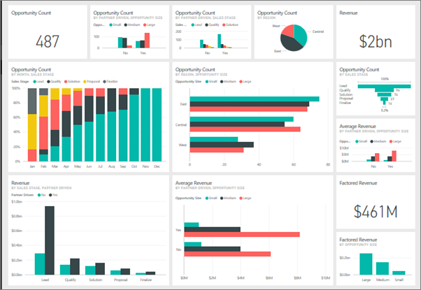
For this step, you need to learn more about best practices for the Power BI dashboard. Here is an example of a power bi interactive dashboard:
5. Save Your dashboard
Your final step is you need to save your already created dashboard. For that click on the “Save button” on the toolbar.
Once you have completed this process you don’t need to worry about updating your Power BI charts. This is because they are dependent on the Excel data and will keep updating themselves as you update the Excel sheet.
Source:- Microsoft Build
Power BI dashboard application also gives you the power to publish the dashboard and share it with your colleagues.
Conclusion:
In this blog post, we have discussed the step-by-step process to create a Power BI Dashboard with Examples.
Frequently Asked Questions:
1. How do I create a dashboard in Power BI?
- Import your Collected Data
- Work with Your dashboard
- Choose the Right Chart
- Design a great Power BI dashboard
- Save Your dashboard
James Ronald
Undeniably, Power BI has matured into its role as a data visualization tool.
Mark
Keep Reading!